CityHub
A Personalized Neighborhood hub

My design team and I were tasked with creating a digital experience for New York City's residents that provided efficient access to housing, permits, voting, the city council, public safety, etc… We needed to create a responsive website with a "citizen-centric approach" that utilizes modern tools and technologies to solve users' problems.

The Background
The Problem
The local government wants to improve the way people interact with them by providing a microsite that is more accessible by their residents.
My Role
My role was to research the needs, goals, motivations, and frustrations of NYC residents interacting with local government websites and create a user-centered design approach to make contacting local government more friendly. My team was made up of four user experience designers, including myself.
Deliverables
User Research, User Interview Insights, Mid - Fidelity Wireframes, Usability Test, Interactive Prototype, + Annotated Wireframes over the course of five weeks.
How I tackled this problem
1. Research
Conduct research to learn about what the current government website has to offer and what can be improved or discarded.
2. Strategy
To understand our local residents better and begin to workshop solutions
3. User-centered design
Prototype, test, and iterate

1. Research
Understanding the (vast) domain
To better understand the problem space that we would tackle, we conducted domain research, street interviews, and submitted a survey to residents of all five boroughs. Thirty-two people responded to our survey. We spoke to an additional 25 on the streets of Manhattan and Brooklyn.
No Commonality
One key issue did not rise to the top as the key issue for the people we spoke to
Multiple Sources
New Yorkers get their information regarding their local government from multiple different sources.
Poor Response
71% of the people we surveyed tried to reach out to public officials with 68.2% receiving no response to calls, emails, or social media messages
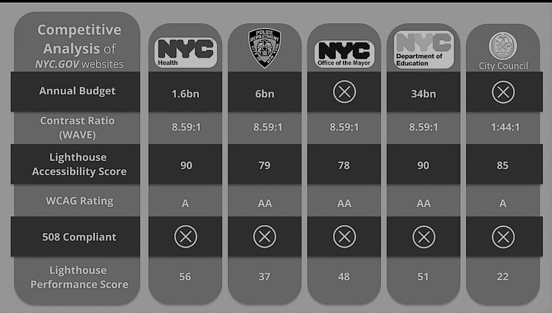
Competitive Analysis
We needed to know how residents could access information now so we looked at NYC.gov. Moreover, we looked at their accessibility scores using Lighthouse
Ky Insight
We learned that these sites do some things very well, like offer over 60 languages that all function with screen readers, but their low performance when adapting to mobile platforms is a barrier, something that we will need to solve with our design.
User Interviews
We then went on to interview a total of fifteen potential users. we had one qualifier, the resident must reside in one of five boroughs in NYC.
Key Insights
Users are frustrated with the additional effort it takes to get a task completed on a local govt. site
Residents who march for BLM are finding a disparity between what they see while protesting and what they see in the media
Residents who normally care about schools, parks, and sanitation are becoming increasingly concerned with housing, policing to an equal extent

2. Strategy
User Persona
Following our initial market research and competitive analysis, I went on to create a user persona to help better understand who City Hub users are and would be.

Meet Kendall
Kendall always cares about multiple issues that affect her and others in her community, and she has struggled to find the information she needed to feel informed when visiting local government websites, which have caused her to become frustrated and feel like her local government is not being fully transparent with the community.

Problem Statement
Time-strapped New Yorkers need a more personalized way of accessing local government so that they can connect to the issues that affect their community in order to have their voices heard.
Design Principles


Accessibility
We serve and empower residents from diverse language, ability, geographic, and socioeconomic backgrounds
Efficiency
To design engaging, easy-to-navigate solutions to address residents’ concerns
Voice
We engage collaboratively with New Yorkers, seeking their insights, and responding to people when interacting with us
Trustworthy
We keep New Yorkers’ personal data secure, and we’re transparent about how we use the information we collect

3. Design

Brainstorming Session
At this point, we all had ideas based on the research we have done, so we then created our divergent concepts utilizing the 6-8-5 method.

Iterate + Diverge
After converging the aspects that tested the best we had created an information hub. And sharing this hub in our immediate community, it became obvious to us that we had created a version of 311.
Combining all our concepts became more or less a search engine for users to access the information they need, but what users wanted more than a streamlined govt. the search engine was a tailored microsite that cut out the noise and showed them what they wanted to see most.
Immediately we shifted, went back to the research and data, and found that the common thread in all our research was that users were concerned with what affected them directly, such as their own immediate lives. So we pivoted into a neighborhood-specific news aggregate and resource for access to local government.

Iterate again
Additionally, we tested a new complaint feature that seemed obvious to us as designers but had no business precedent we could find. If the request is to listen to users, then what could possibly get in the way? The feedback for this feature was so overwhelmingly positive it gave us pause, why was this not currently in effect?
Guaranteeing a local government official will answer the users is not feasible.
Our new problem statement read:
Time strapped New Yorkers need a more personalized way of accessing local government so they can connect to the issues that affect them in order to voice their concerns
Testing our Concept
Once our updated prototype was ready, we were excited to find out— does it actually work?

Key Insights
Users liked the simplified interface, and large icons made navigation easy
Geolocation was a barrier for users
- This was an issue with the prototype; in the real product, the users would be able to enter their address, but in the prototype, they had to click the icon and grant access to their location
The concept of a hyper-local govt. the website that gives users access to information about their neighborhood was universally popular with people we tested
Solution
Citywide new aggregate
Neighborhood news aggregate
Construction schedule
Public safety
Local representatives
Voting
Dept. of Housing
Dept. of Education
Report a concern
Voice my concerns
Connect with my neighbors

The Next Step
Our next steps involve working with UX/UI accessibility experts to get this prototype into the hands of differently-abled people. We will test to ensure that everything from text size to color contrast, an orderly navigation system that can be voice navigated, serves the most expansive group of users possible.
Case Study 2: Force Fit